The Making of a Silkscreen Print
Over the years, I’ve acumulated much experience with taking photographic images apart and reconstructing them back together in the silkscreen process. It is a process I’ve taught a number of courses in at Cooper School of Art in Cleveland, Western Michigan University in Kalamazoo and Colorado State University in Fort Collins. It is an exciting printmaking process to work in and teach that has quite a few ceremonious steps along the way to a final print. For me, it is a process of previsualizing final color choices in my head and technically understanding how the jig-saw puzzle fits together. You can never really see the final result until the last ink is printed and it can be a moment of overwhelming excitement.
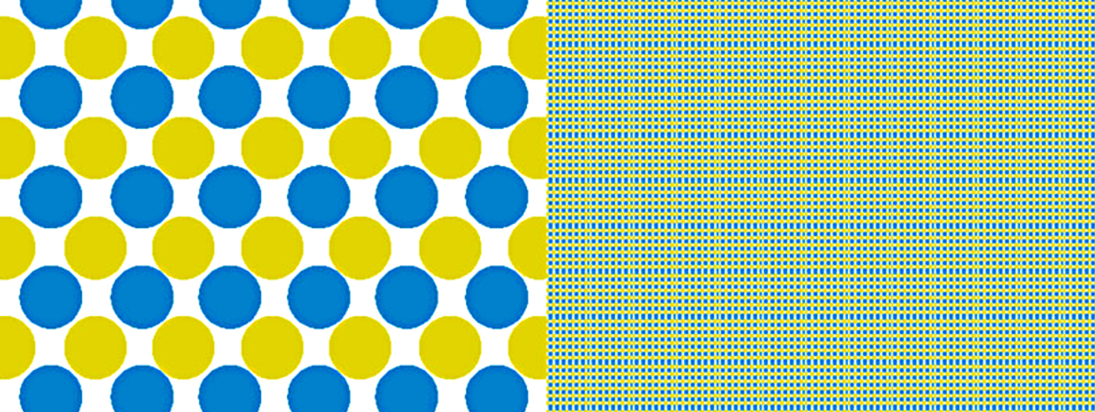
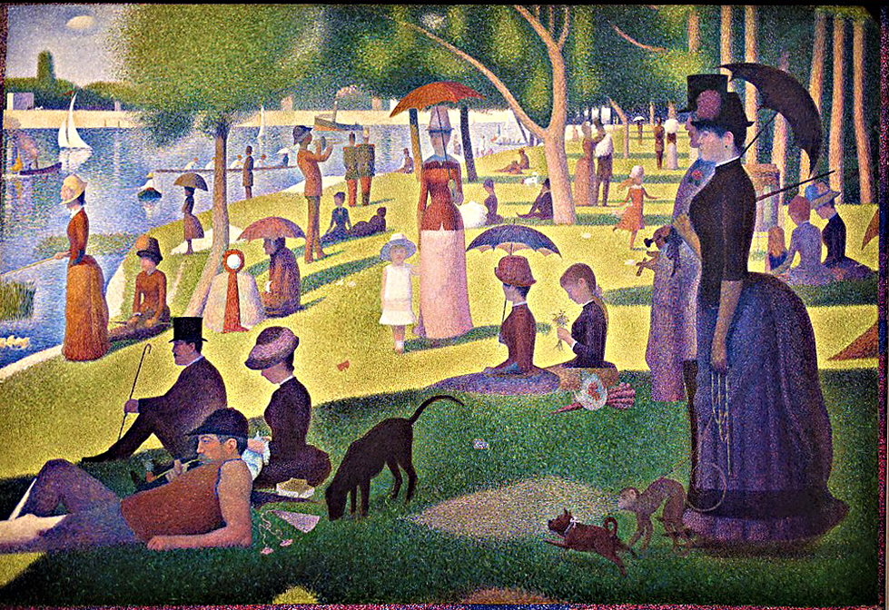
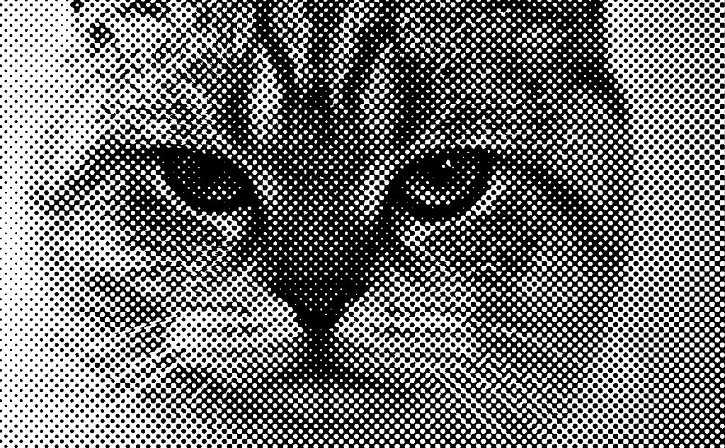
The silkscreen process is inherently a two-dimensional graphic media. In my work, silkscreen printing involves figuring out how to get the most out of a minimal number of colors. Screen printing is always a high contrast process – either the ink goes through the screen or it doesn’t. Getting more than one value out of a color involves optical illusion, traditionally with mechanical halftone dot patterns, such as you find in a b/w newspaper photo. With high contrast dot patterns, it is the eye that mixes the juxtaposed dots of color to see new colors, much like Seurat and Pointillism where dots of one color (say yellow) are painted next to dots of another color (say blue) and they optically mix in the viewer’s brain (resulting in green) instead of physically mixing blue and yellow together.

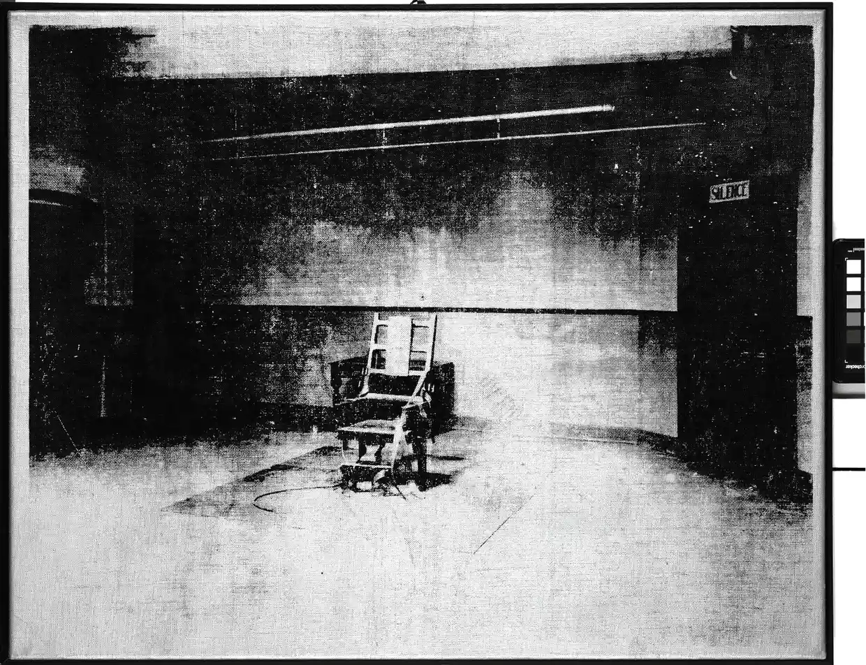

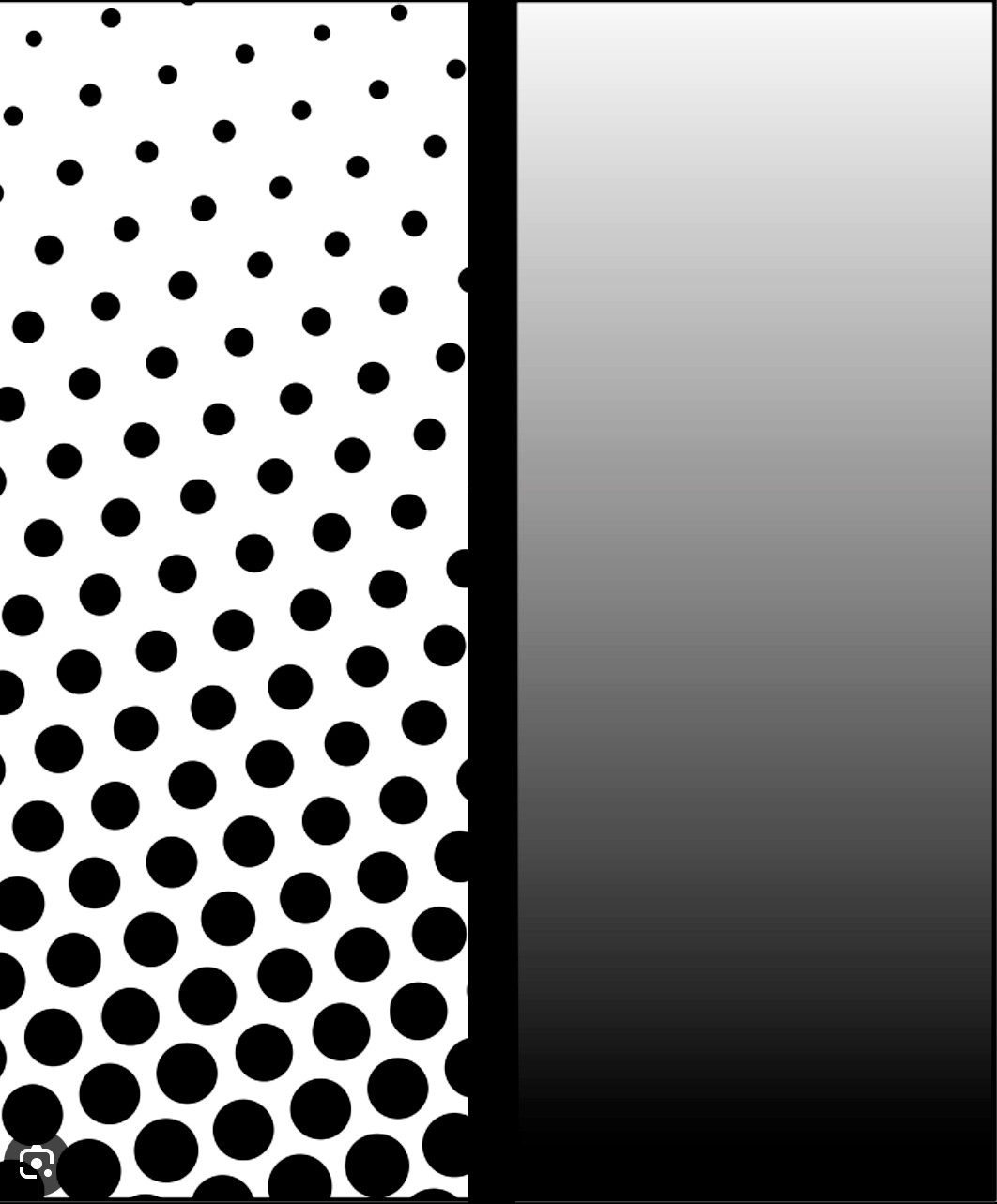


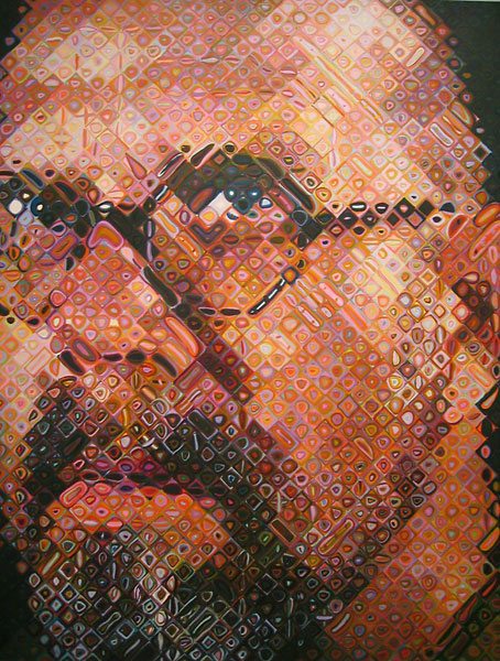


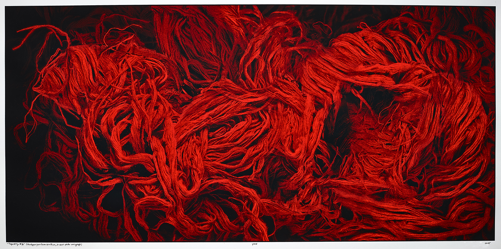
In my earlier work, I experimented in the darkroom to create organic types of dot patterns, instead of mechanical halftone dot patterns, to create the illusion of values from a single color of ink. The challenge of the print below was in reconstructing the image with various organic and mechanical dot patterns that are unique to digital technology, in order to “milk” the value range of each ink. To do this I separated the image apart, deconstructing it, in unusual ways that I then converted to “dithered” organic dot patterns and “indexed color” dot-patterns thus creating layers of high contrast dot patterns that I could build a silkscreen print with – a process that stretched my intellectual capabilities to their very limits.
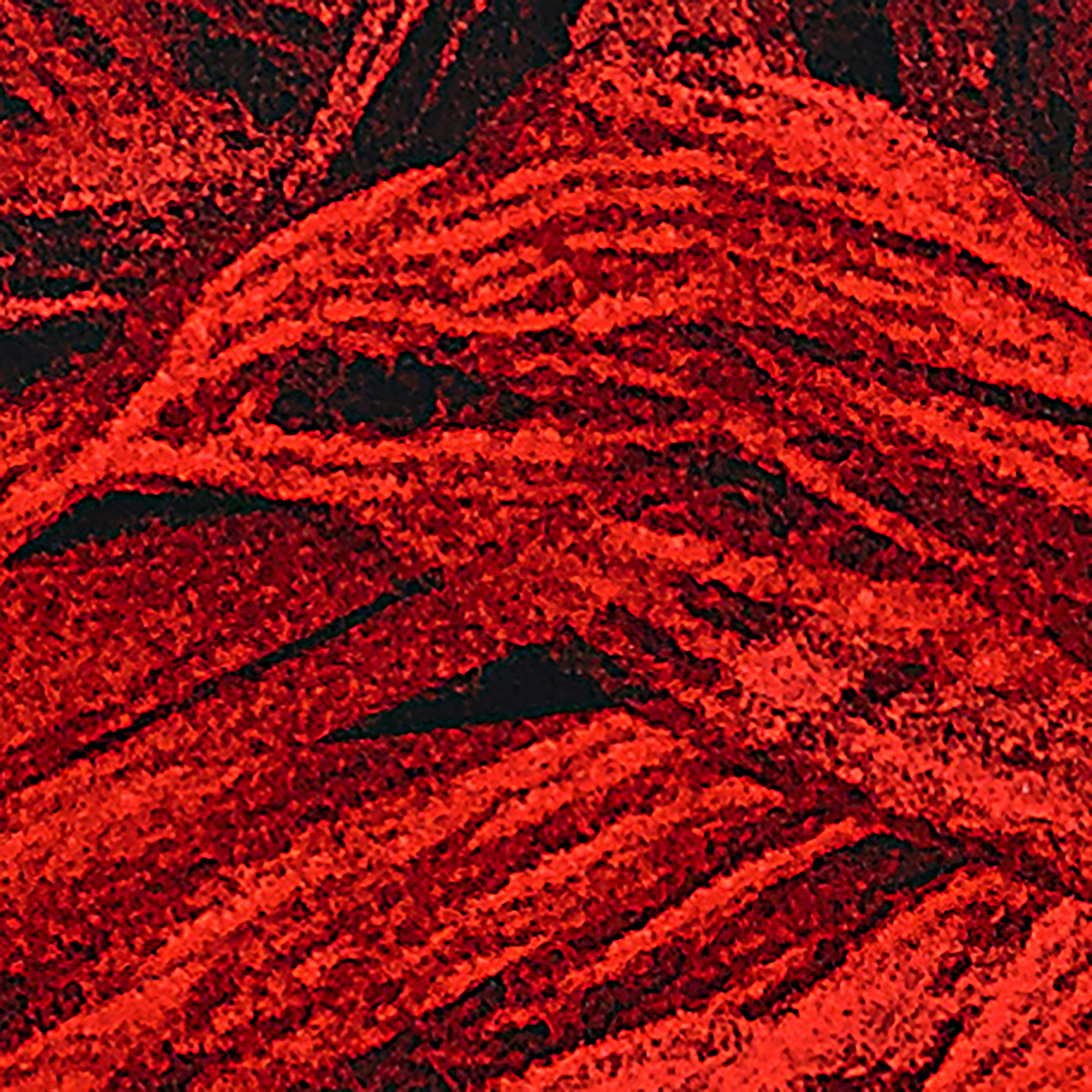
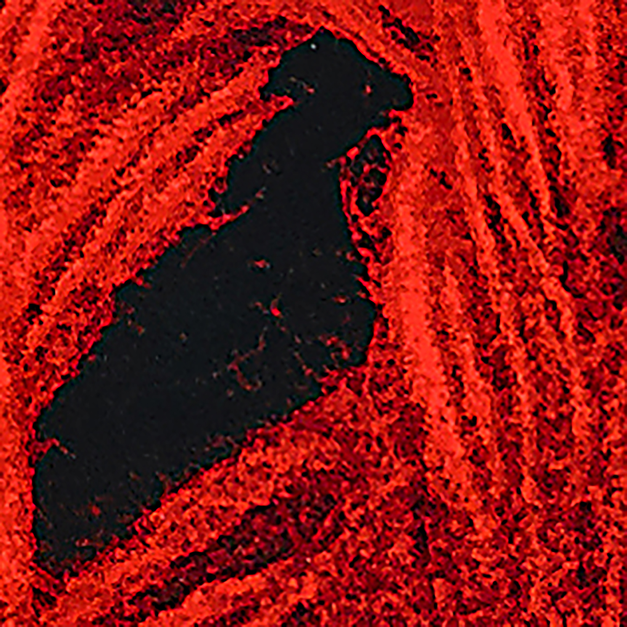
When you stand back from the print, it is very 3 dimensional. But look at it up close and see the way in which it is constructed and you can see how graphically 2-dimensional the process really is.




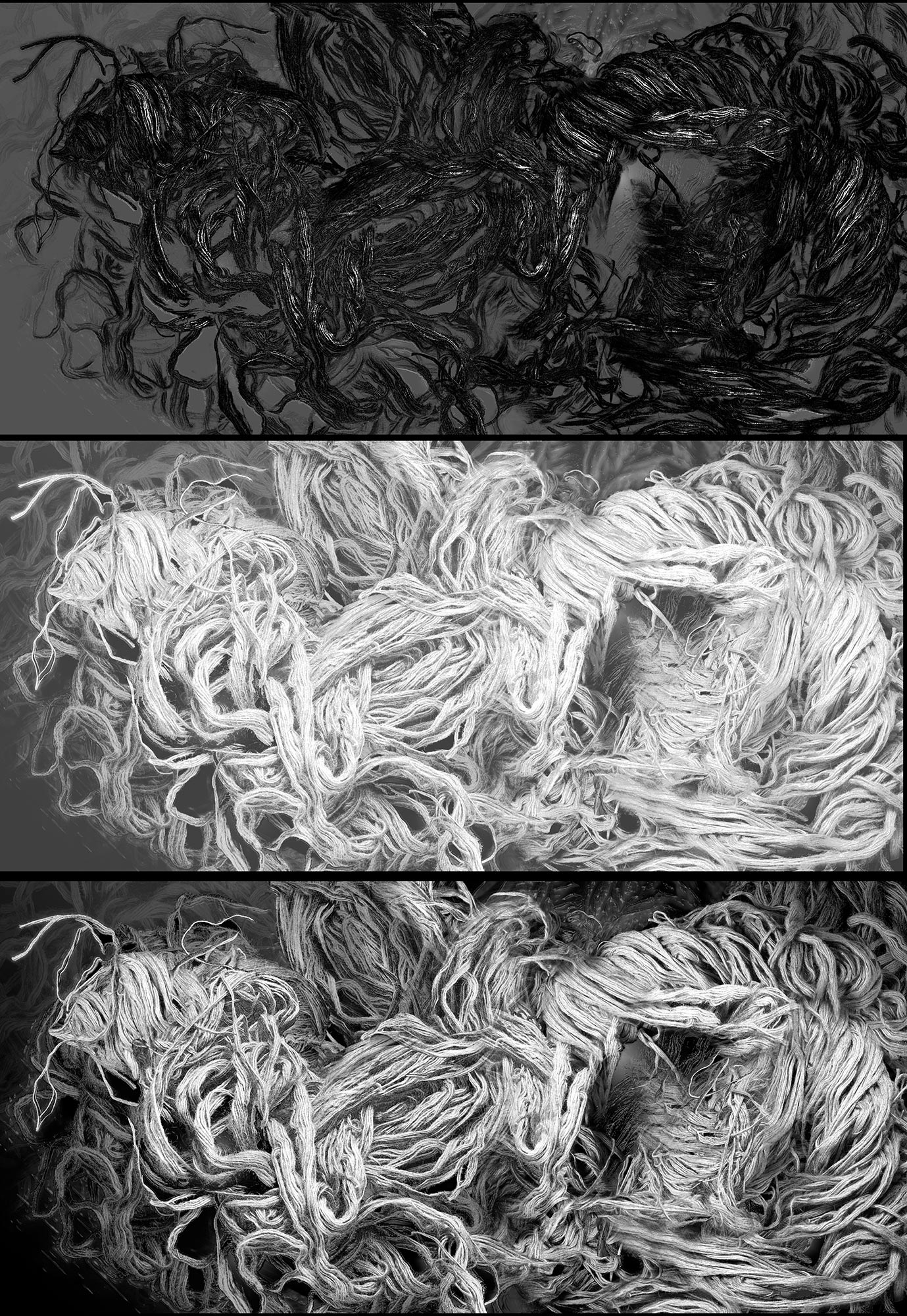
To create this silkscreen, I separated the colors into unusual value versions of the image, taking the image apart, creating special effects and high contrast dot patterns, which I layered back together in the silkscreen process. Here are examples of the Magenta and Cyan channel from a CMYK color mode and the Red channel from a RGB color mode.

I then proceeded to digitally experiment with these image versions to create unusual organic dot patterns that would be used to print with. Here are some blow ups of the dot patterns that I created to give the illusion of many values from each ink color I would print.
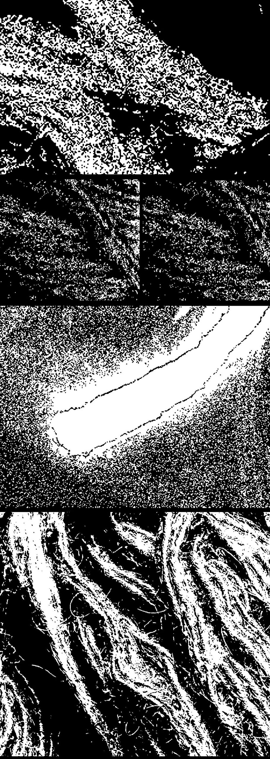

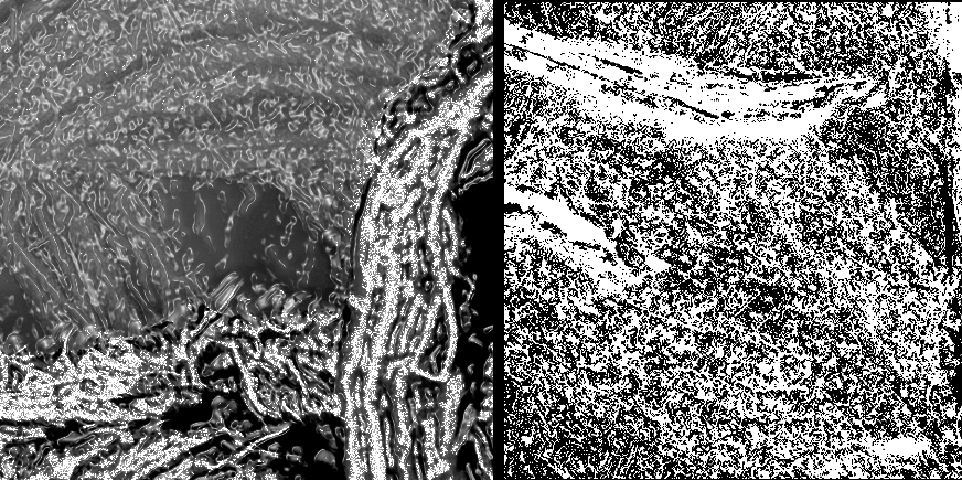

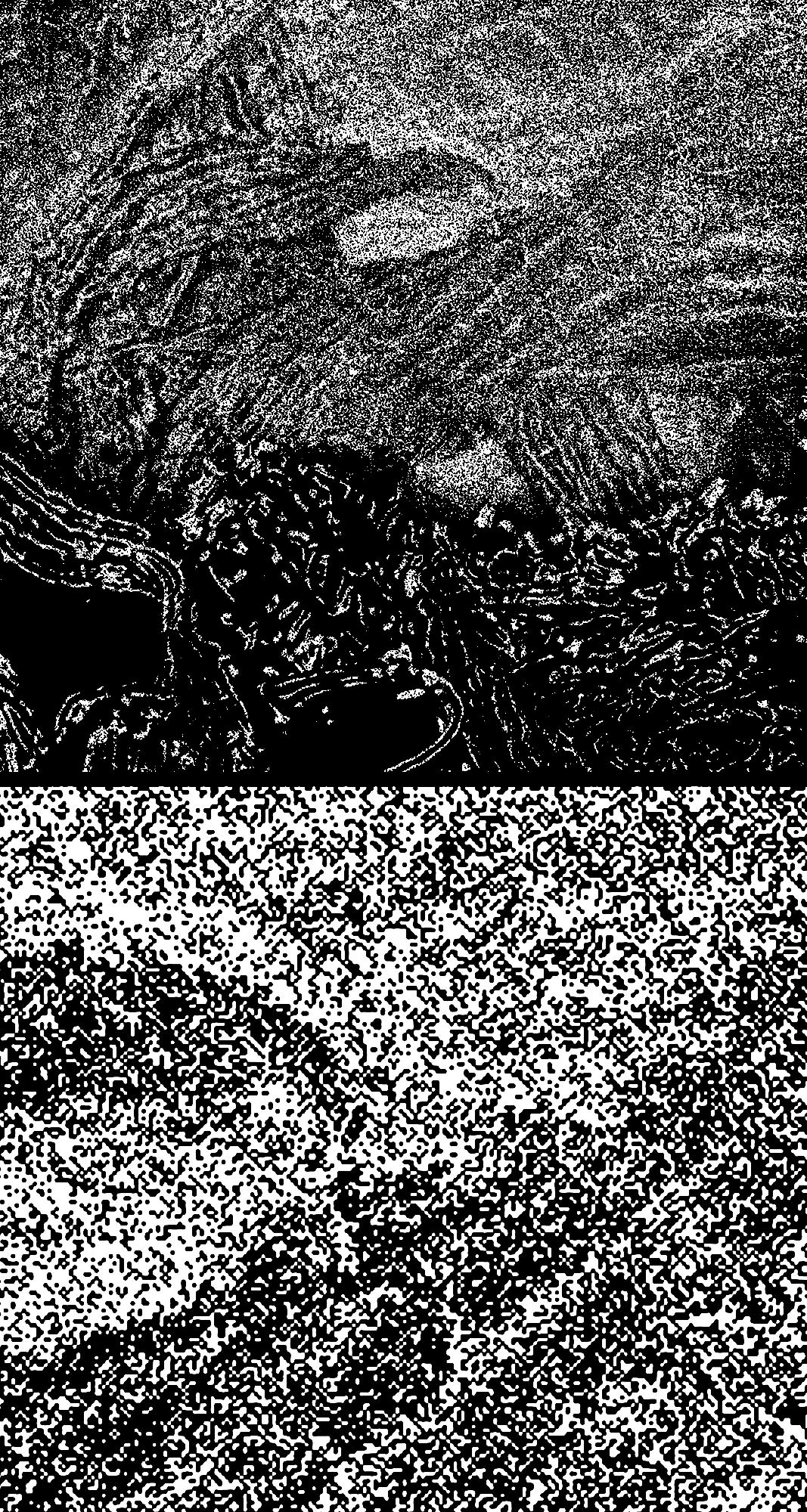

These are some examples of the final plates I created to make the screens with. Each high contrast image is then digitally printed on clear film. The screen is coated with a light sensitive emulsion. The film is put in contact with the screen. Bright light is exposed through the film image onto the screen emulsion. Where the light comes through the film, the screen emulsion is hardened. Where the light is blocked from the black image on the film, the screen emulsion is not hardened. The screen is then hosed down with water and the hardened emulsion remains on the screen and the unhardened emulsion is washed off. When printing ink on paper with the screen, the areas that are not blocked are where the ink goes through the screen onto the paper.
Individual colors are mixed up and each screen (or black plate) is used to print a different color. Each color is then printed in sequence on top of the previous color, building up color layers until all colors are printed and the print is finished.
The following sequence are some examples of high contrast images that I created that were used to make the screens. i didn’t use all of these but chose 8 of these to print with in an exact sequence, layering one ink color on top of the other.


This is one of the screens after it has been finished. The green is the emulsion that is blocking the mesh of the screen and the yellow is the color of the screen fabric that is completely open for ink to go through.
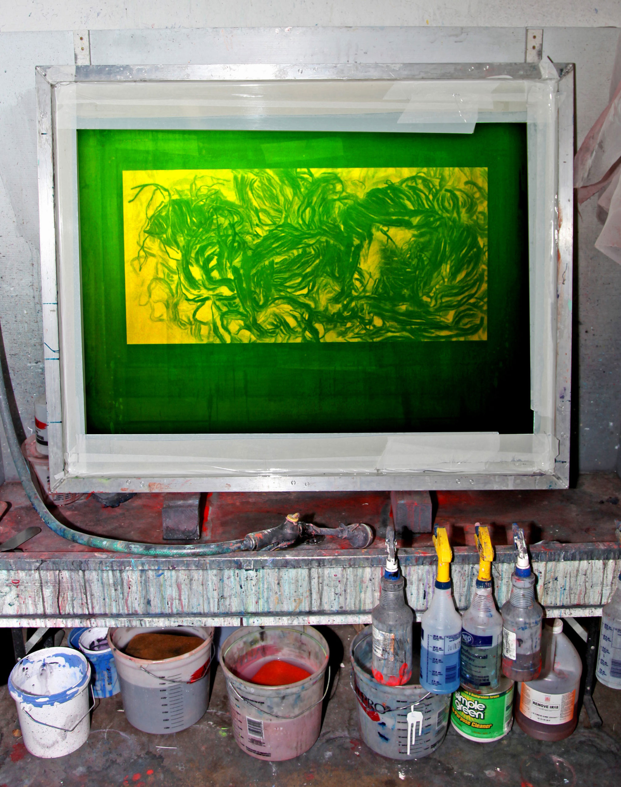

When this ink is pulled over the screen with a squeegee, the red ink will pass through the yellow screen mesh onto the paper below, resulting in a red image of this pattern. This was a special color layer that I created by hand (not digitally) to layer between other digital layers of the yarn image.
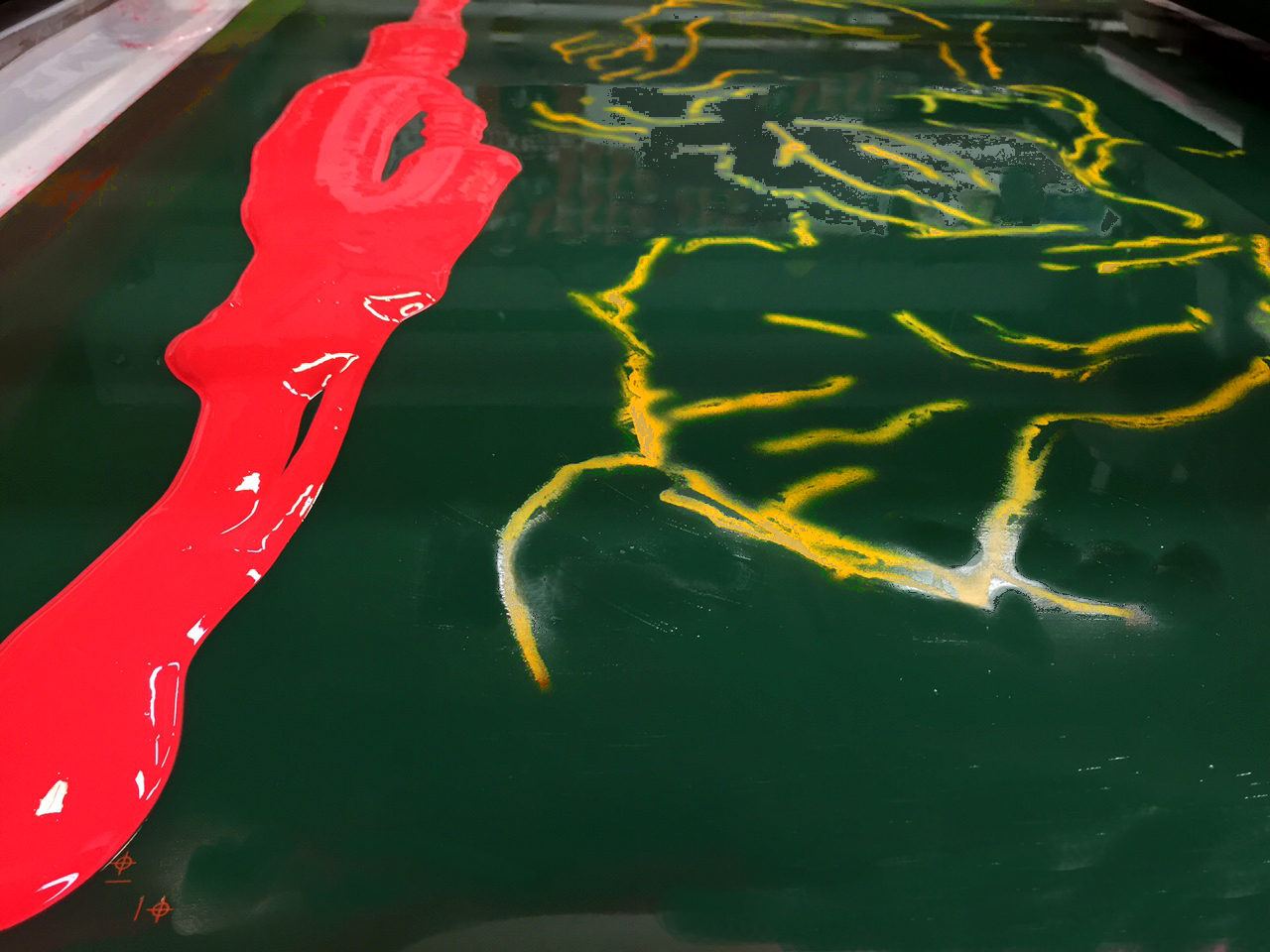

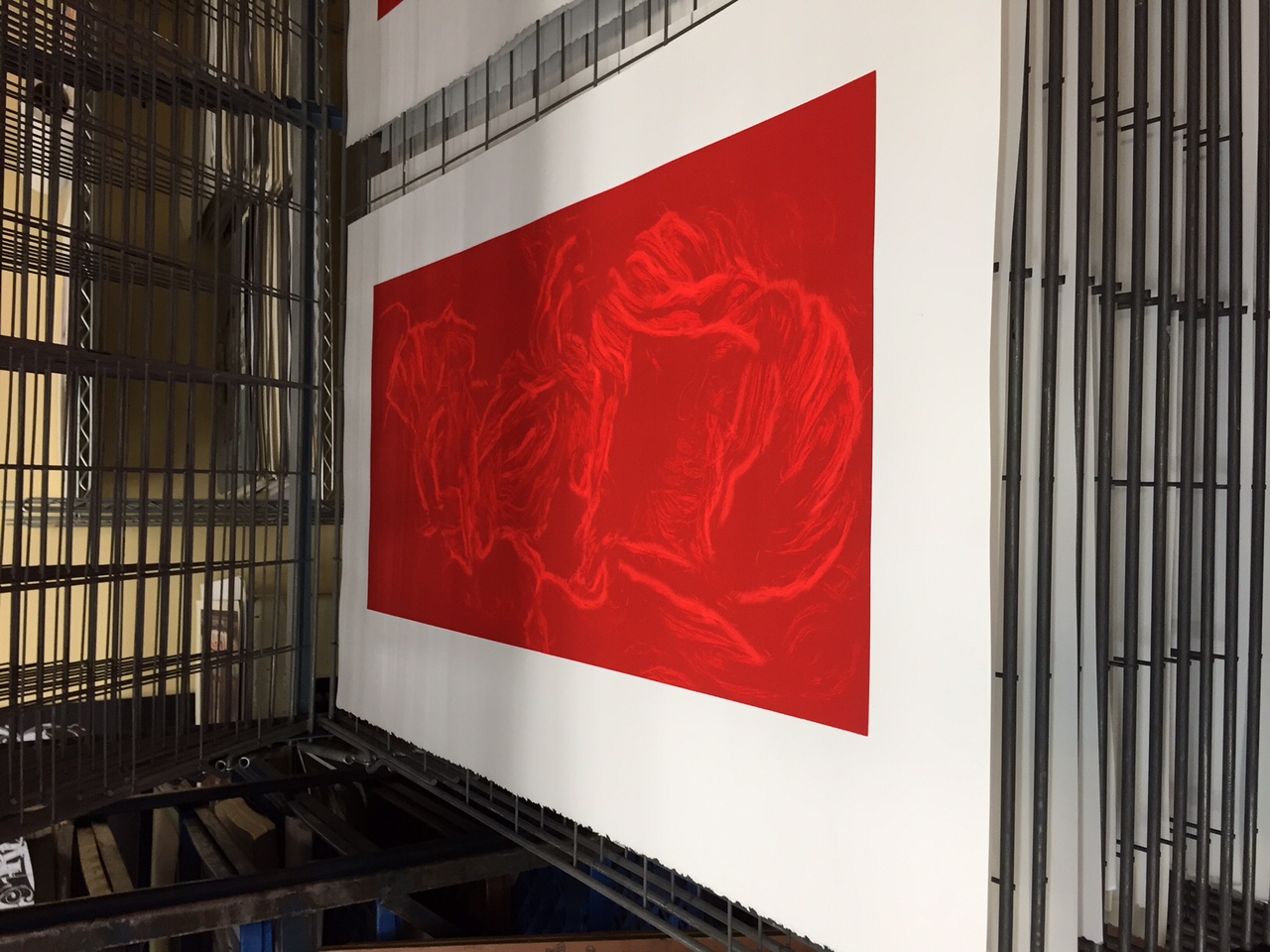

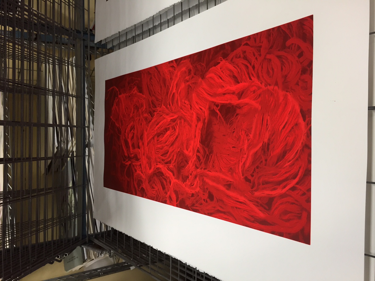

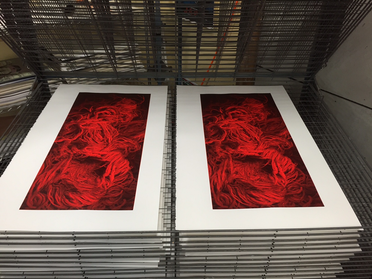

Most of my screen prints were done over almost 40 years of working with oil based screen inks. I worked with the oil based inks and solvents because the inks are far richer in pigment color than water based inks. The last print I made, made me very ill from the toxic vapors of the inks and solvents in my lungs and sinuses as well as solvents absorbed through my skin. (This was despite strong air flow outside in the open air.) The extreme toll on my health and life span from process was beyond obvious. I finally decided that I had to find another color process that gave me similar satisfaction that was not so toxic.
A close friend of mine’s father had died and my friend found some very obscure equipment in his basement and asked me if I knew what it was and if I wanted it. The antique equipment was used for a difficult process known as dye transfer printing. I had just seen a show of Elliot Porter’s dye transfer prints and was inspired by the color quality of dye transfer. It was at that point that I began the process of dye transfer printing and stopped silkscreen printing altogether.
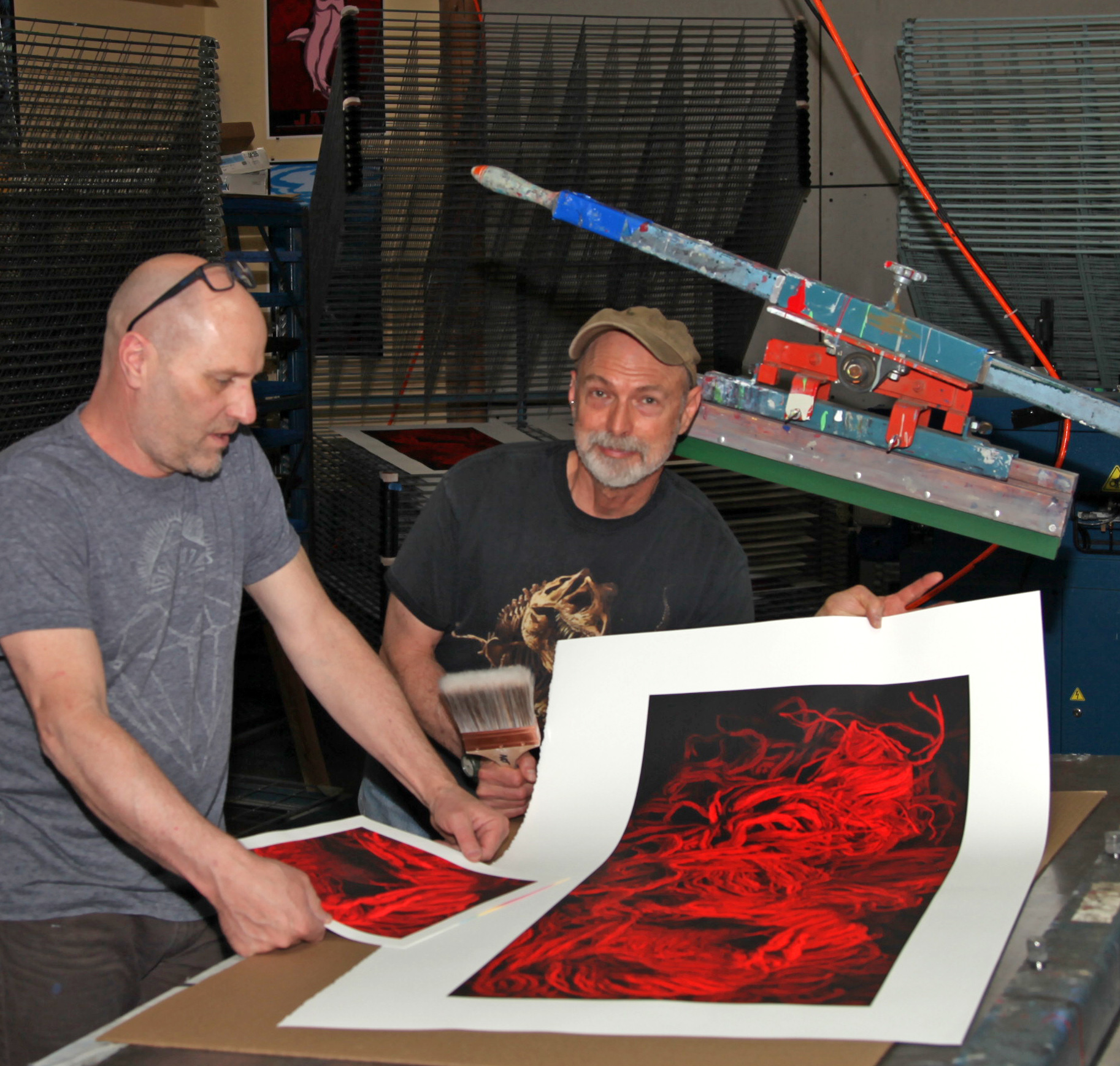
It wasn’t until several decades later that I had the opportunity to work with Martin Hammond of Diamond Hill Screenprinting (here in Denver). At that point in history, I was able to utilize my knowledge of digital image-making along with my knowledge of silkscreen printing. We were able to work with water based inks and special ordered some highly pigmented red inks just for this print.


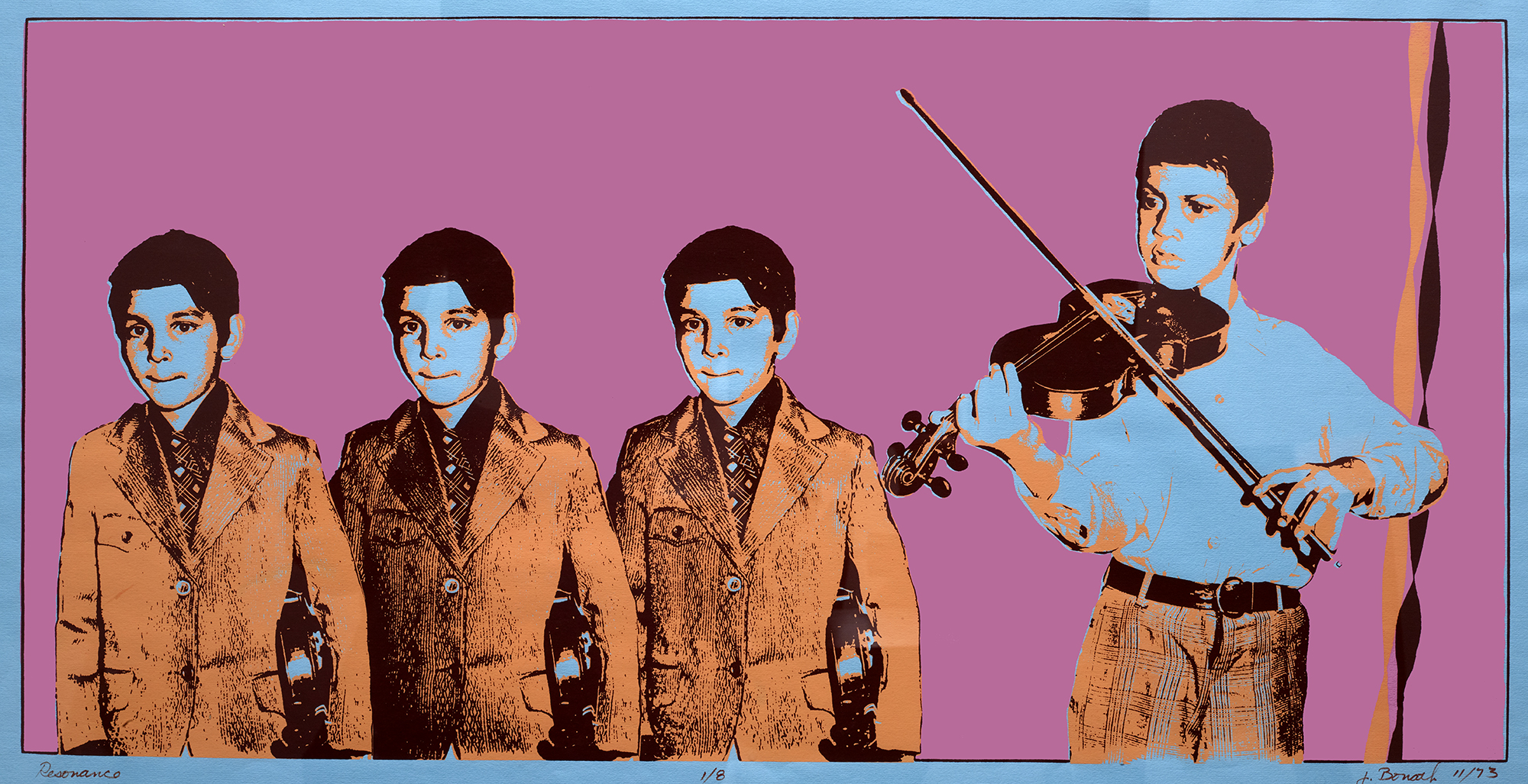
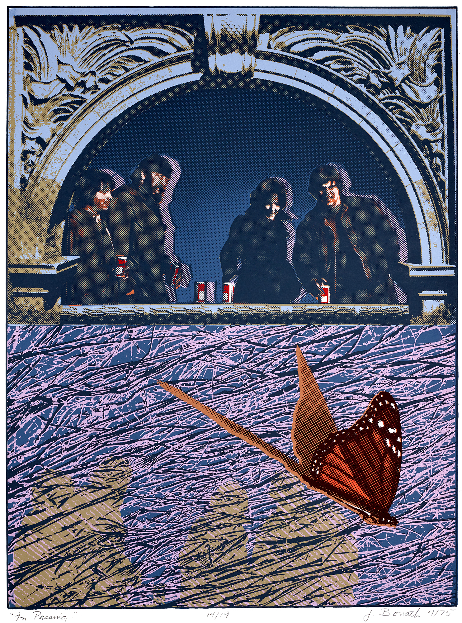
I taught myself the photo-silkscreen process in the early 1970’s. Here are a couple representative samples of my silkscreen work from that era. (You can see the mechanical halftone dots I was creating at this point in time.)


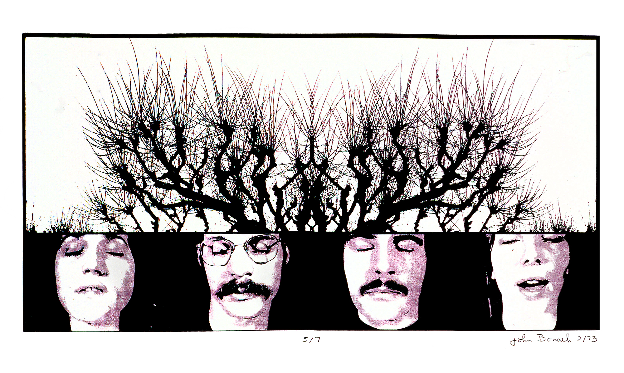

Here are a couple samples of silkscreen work from a later era – a series I did for my Master of Fine Arts thesis entitled A Theory of Displacement.
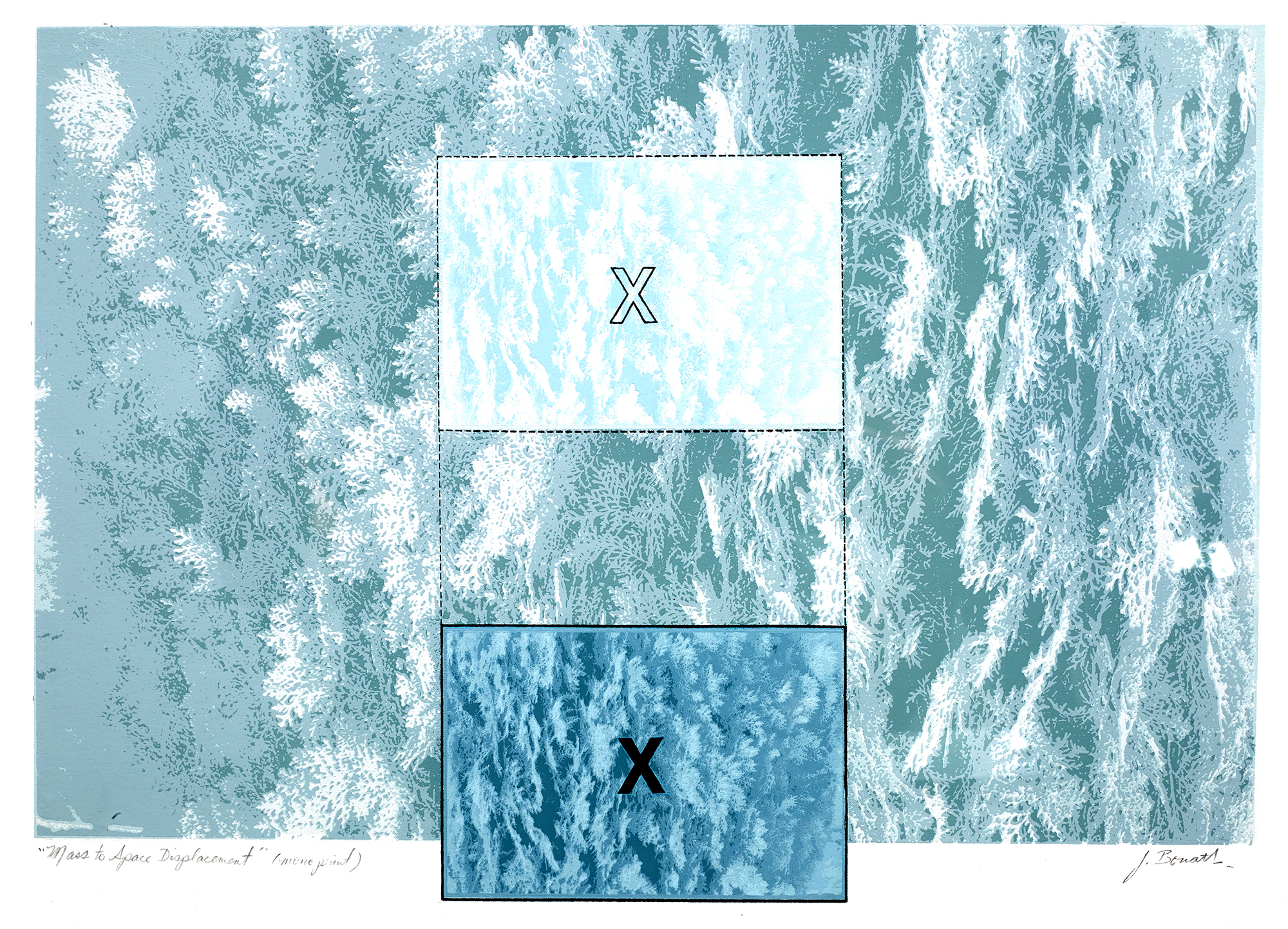

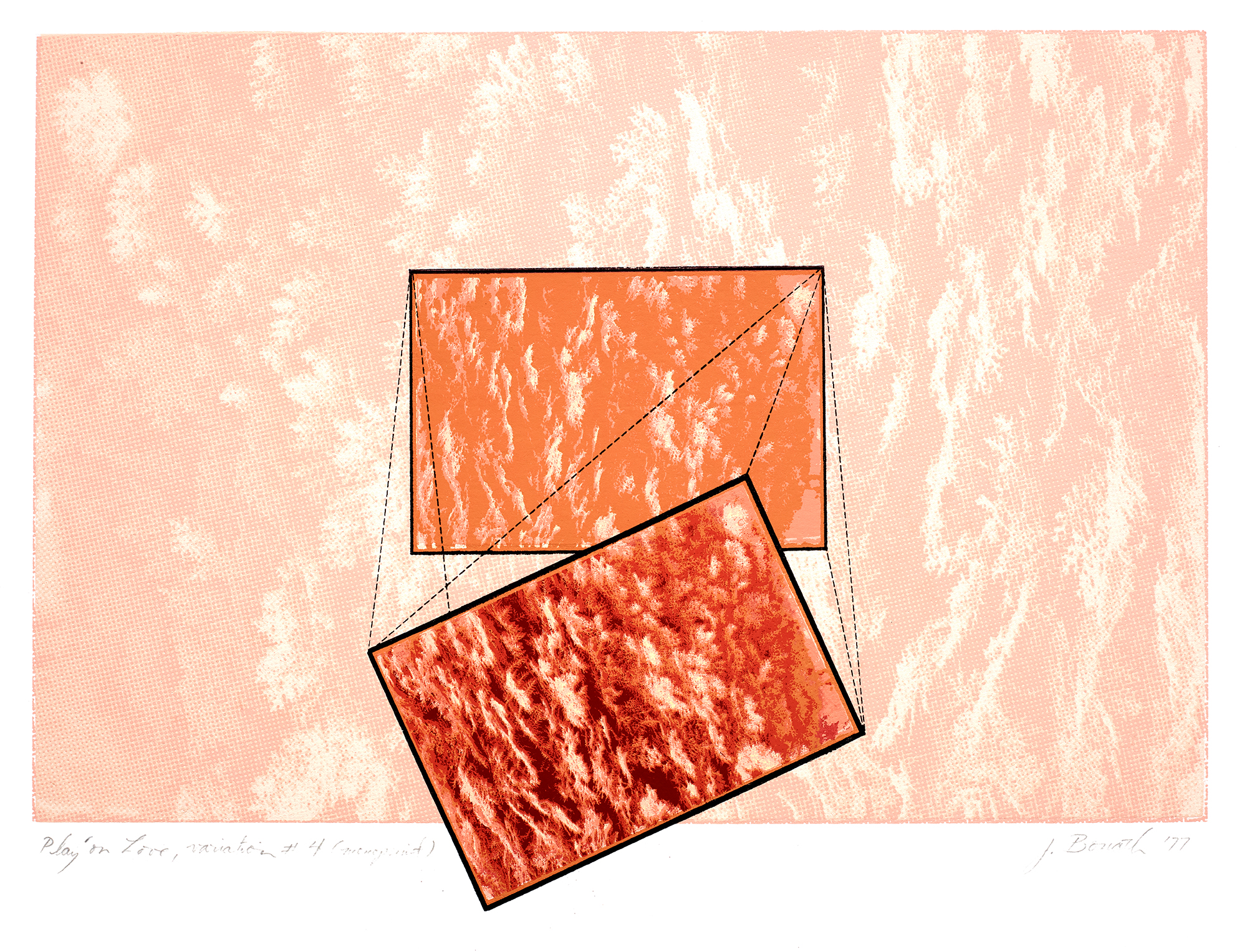


Here are a couple of the last silkscreen prints I did in the late 1980’s and early 1990’s when I was running the BFA photography program at Colorado State University in Fort Collins. (You can see the organic dot patterns I was evolving at that point in time.)


Emily Allred
Great read! Very interesting explanation of how you created this beautiful piece. I would love to make it to a show of yours one day. Until then, sending love.
Anna S.
Fascinating process with a deeply engaging product. I got lost in the dots, and loved how the image changed at different scales. Thank you for sharing!